Creating a scalable and consistent design system
Creating a scalable and consistent design system
client
Rolls Royce
client
Rolls Royce
role
Senior UX/UI Designer
timeline
2018 - 2019
responsibilities
- Design system deliverable
- Documentation of design
- Coaching internal teams
- Work in parallel with Pentagram
- Implement the new brand to the system
- Scale design internally on Rolls-Royce
role
Senior UX/UI Designer
timeline
2018 - 2019
responsibilities
- Design system deliverable
- Documentation of design
- Coaching internal teams
- Work in parallel with Pentagram
- Implement the new brand to the system
- Scale design internally on Rolls-Royce
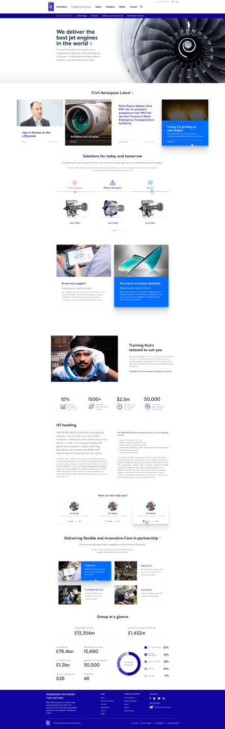
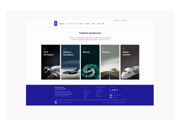
Powering digital communications
Rolls-Royce started a rebranding process with Pentagram, delivering new brand guidelines, and their digital positioning was affected. Collaborating with Pentagram to find a new digital status for Rolls-Royce was challenging; there were heritage files from 8 years past or more, and each page of the website was in separate Photoshop files, confusing, not scalable and complex to understand the source of truth.
Challenges
- Files scattered on google folders
- Brand refresh not ready
- Migration to Sketch
- New requirements from RR
- Time constrain to do a launch
- Accessibility issues identified
- Heritage pages and components
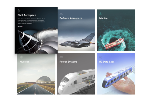
- Three distinct usages of the brand
- Files scattered on google folders
- Brand refresh not ready
- Migration to Sketch
- New requirements from RR
- Time constrain to do a launch
- Accessibility issues identified
- Heritage pages and components
- Three distinct usages of the brand
High level goals
High level goals
Design a system library to be used internally and externally
Implement Pentagram brand refresh in the digital products
Expand the design using hints of pink to display RR as a pioneer company
Impact
190
Components created in the library, expanding their flexibility with design
108
Text styles were carefully designed to be used on all platforms
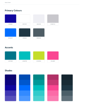
1152
Atomic symbols inside the design system to support scalability
67%
User interaction increased after the launch of the new design system
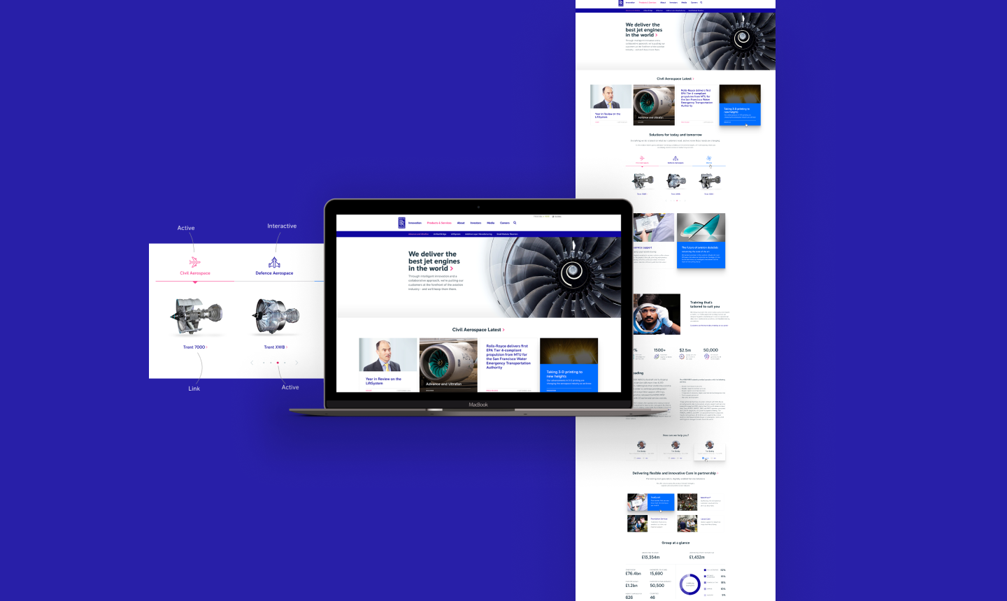
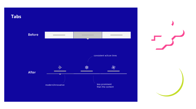
Using Sketch to develop the components library
Using the Sketch library at the time was the best decision to scale and deliver the project. The main goal was to make the library as easy as possible because internal RR employees were designated to create new pages after the design system launch.
Micro-interactions designed to enable the user delight
With the new pioneering idea for the brand refresh, I have designed micro-interactions to show RR as a forward-thinking company. Based on the 7 design attributes from Steve Krug, these interactions add: Memorable and Delightful to the product.
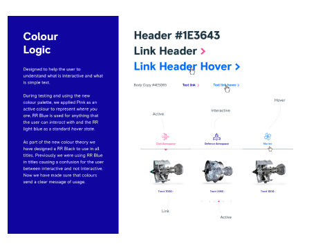
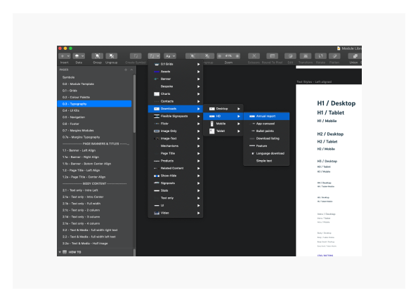
Comprehensive documentation to create consistency
Because internal and external people were to use the system, documentation was necessary to align how the design system could be used and how to apply the system consistently. It was made a google doc and snippets inside Sketch to guide everyone on the usage guidelines.
How might we educate new joiners and mature the UX mindset internally?
Collaborating with all design leads, content designers and researchers, we have produced a unique set of slides to teach all about UX in a short 50 minutes bootcamp. This has helped other business areas to understand and value design.
In retrospect
It's hard to achieve consistency and scalability with massive brands as there are many points of contact internally and externally. Still, it's possible if the correct documentation and file structure is designed. Larger corporations need more design articulation to make projects happen, and this was something I had to learn each day with RR business stakeholders. What would I change if I did this project all over again? Mainly the tool, instead of Sketch to use Figma as it is easier for non-designer people, and documentation on Notion is more shareable and easier to read.